
ShootProof Invoices [UI, UX, IxD]
I worked on translating UX research and task-flows into functional user interface prototypes, interaction models, and finally finished UI specs.
ShootProof: Photography Studio Management Software
Project:
ShootProof Invoices
Role:
Senior UI Designer, with a focus on Interaction & Prototype Design
Date:
Feb 2016 - Aug 2017
Website:
https://www.shootproof.com/features/invoices-for-photographers
Description:
On the heels of ShootProof releasing our key feature of ShootProof Contracts, ShootProof Invoices aimed to be the perfect counter part in automating and facilitating an elegant invoicing tool for photography studios looking for further studio management features.
Introduction
Project Overview
ShootProof Invoices was planned and executed as a counterpart feature to ShootProof Contracts. After our studio contracts feature released, we instantly heard overwhelming feedback that an invoicing and payment feature would help users execute online contracts. And dagnabit we thought so too! The goals for ShootProof Invoices were to auto-populate client information from the studio’s address book, automatically be associated and/or generated from a contract, and would prompt clients to make online payments - all from one tool!
Problem Statement
Many event-photographers found utility in our online contracts, but either had to create their own invoices or would not use any invoicing until a client would ask for one. The end result was a professional-looking contract, but a disassociated invoice. This did not build trust with end clients, nor did it help remove blockers from our photographers and studios. There was a clear signal from our support team that photographers and studios who used contracts would have a difficult time associating payment schedules with contracts as ShootProof was seen as the primary studio administration tool, which wasn’t serving a significant administration function: invoicing! There was a secondary signal that we discovered via user research: the sentiment that contracts “seemed cool”; however, after the contract was signed, many photographers and studios would ask, “ok… now what?”. Through user studies, interviews, and divergent business-model ideation, the design team identified invoicing as a potential to help drive contract feature usage by automatically generating an invoice, and allowing the photographer or studio manager to set up payments, email an invoice with a contract, and kick off some administrative tasks semi-automatically.
My Role in the Project
I worked on translating UX research and task-flows into functional user interface prototypes, interaction models, and finally finished UI specs; ready for developer collaboration & production. With the UI prototypes, we were able to identify UX problems with split payment tools early, as well as validate hypotheses and assumptions on digital invoicing in the photographer’s context.
“I worked on translating UX research and task-flows into functional user interface prototypes, interaction models, and finally finished UI specs; ready for developer collaboration & production.”
After the prototypes, I worked and lead the design of interaction models as well as high fidelity visual design rounds to stay true to the identified UX priorities as well as adhere to our visual design language. Finally, I supported our font-end developers with visual QA, design specs via Zeplin.io, and Confluence documentation. I also wrote a shit-ton of Jira tickets.
Process
Understanding the User and/or Problem
Many of ShootProof customers are part-time photographers who either have other businesses, work other jobs, or had families who were a priority. Learning business models, spending time on administrative tasks, or doing anything other than spending time behind the camera became motivators for avoiding necessary business tasks. Anything we could do to remove that time away from the camera or Adobe Lightroom was a massive priority for our primary user base. Another priority for our key personas was the ability to clearly communicate invoice price points, which were split into multiple payments. Our amateur event photographers would want to increase their price points but found that larger invoices usually caused delays in clients paying those invoices. Our most active users wanted digital invoices to be generated and automatically associated with the digital contract with the options to split payments, accept online payments, and print those invoices with their contracts.
What I did & Why
The lead UX practitioner on this project was a kayaking fool named Dominic “Dom” Distretti. Dom had produced the most functional and complete set of wireframes I have ever seen in my life. They were so good that I went to a local printer and printed them on large sheets of paper. I wanted to hang these up at home and in the office to look at full user/task flows.
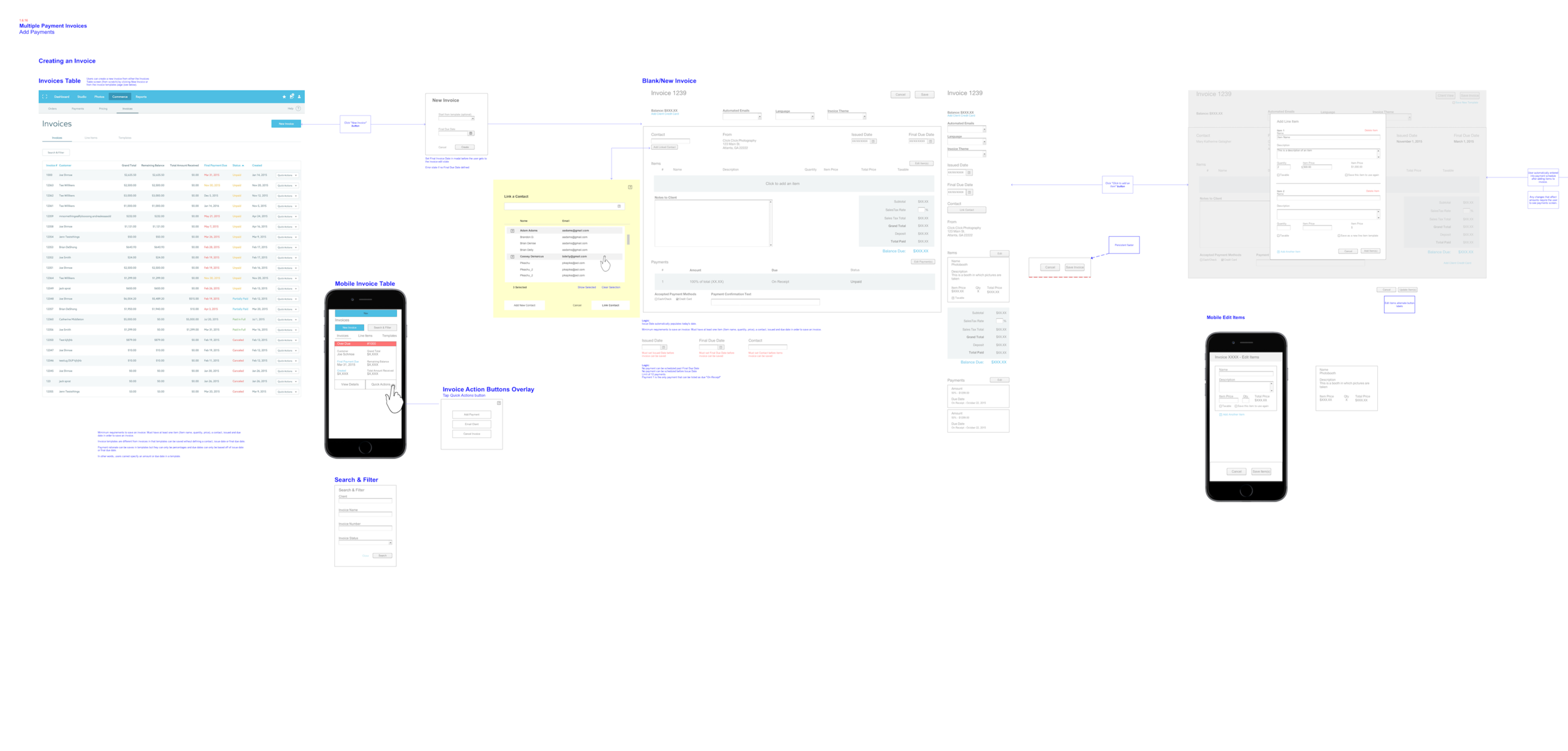
Wireframes for one userflow: Create New Invoice. Click here for full image.
One of the user flows printed out on architect-style drafting rolls. Ray Bans for scale.
User flows hung up in my living room at home and you can see another flow laid on my TV to the left. There were 5 total.
Dom and I would work daily as we built prototypes and interfaces to expand our component library while following our design language (pre-design system). We would also use these wireframes to annotate during review meetings with our front end team as they began to plan their own build.


An essential aspect of our design process was building disposable prototypes. A disposable prototype is one that is used to validate a hypothesis about an interaction and doesn’t need to be “final UI,” as we would say. Principle for Mac + Sketch App were the tools I used to generate clickable prototypes as we had people click around to complete tasks. All of our user-testing was done in the office first with team members who were photographers but not on the product team. We also had customers come into the office, and we’d lovingly bombard them with all the questions we were excited about.

I built many interactions around specific contexts using well established patterns. The purpose was to discover the lowest friction between jumping in to something and understanding what’s going on.

Once we removed half of what we had planned to build (based on user feedback & considering business goals), we were left with an interface that people could use. That made us feel really great.

Drag and Drop Interaction Prototype
Finished UI above, with it’s interaction prototype below.
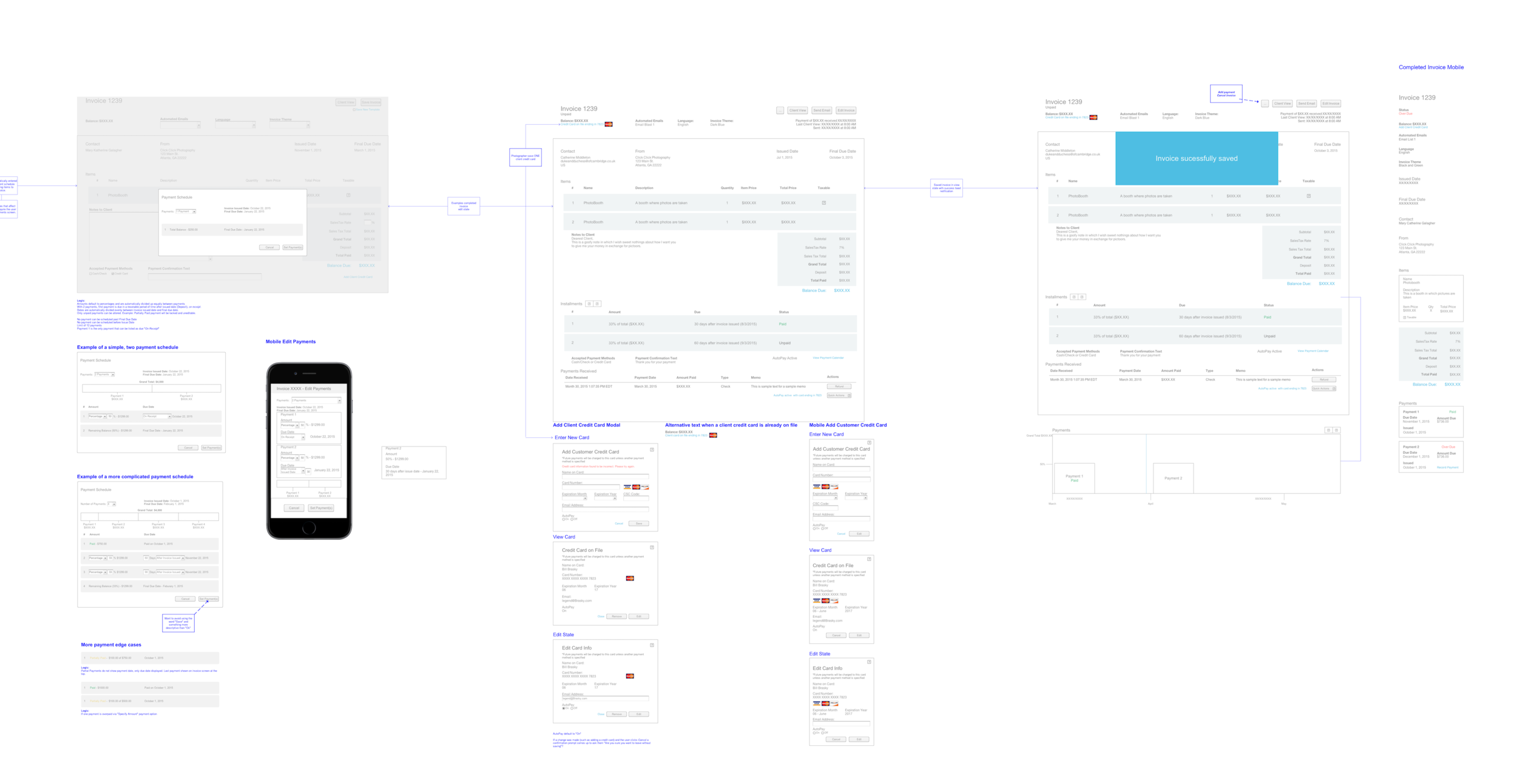
Split Payments Interaction Prototype
Something I’d like to call out is an opinion I formed about modals and their behaviors. Above is what I considered “proper” behavior. The top of the modal never changed positions and was the “anchor” of any interactions. When content needed to expand, the modal would grow downward in a seamless transition to show the user the change in information.
Below, the modal would be vertically centered and would expand in two directions when the information needed to change. This is too much in my opinion and I found it added to the “what the hell is this thing doing” sentiment in our users.
Client Payment Interaction Prototype
An aspect of UI/UX design that I am particular about is error handling. More times than not, the UX around errors are tacked on as the last thing considered or they aren’t even thought through at all. Think about it, when was the last time you saw an error that both told you what was wrong, and what you could do to help?
Through user testing and interviewing, we discovered some easy ways to help the user out and did our best to embody “Poka-yoke”, the Japanese concept of “inadvertent error prevention” on the user’s behalf. Errors are inevitable with software so we did our best in providing signifiers for those moments.


Not every error needs to feel like the end of the world. We developed a concept of “Elegant Error Handling” and did what we could to build some logic around types of errors, and how to communicate them. In the example below, there was a “Timeout” error, but we chose to avoid displaying any red text or anything alarming. Sometimes with a Timeout, a simple refresh of the data-send would fix the situation. We tested around this hypothesis as shown below.
Elegant Error Handling is focused on helping the user, without alarming the user.
9% Adoption
Adoption rate after 90 days
33% Activity
User base using Invoices after 6mo.
2.5% Incr.
Increase in payments processed
A small component library built with the goal of reusability. The Invoices project seeded what would eventually become our “Pattern Library”, a first step towards a Design System.
Everything we built wasn’t mobile first, but we always added mobile considerations or a responsive strategy.


Finally, I worked with Dom and Matt Pence (my partner in crime and ShootProof’s other UI designer) to produce the landing page which funneled people towards logging in and trying out the new features. Matt is also the designer of that slick Invoices Icon we used in the left-hand static panel.


Result
Outcomes & Learnings
Invoices launched without a problem (almost)! Out of our 25k customer-base, we saw an adoption rate of about 9% after 90 days. Out of the first 2,250 customers to use invoices, 50% had zero touchpoints with support. The other half ended up feeling indifferent and had questions, or outright hated the way we implemented the split-payment model.
After 6 months, we found that almost one-third of our active customers were generating invoices with their contracts.
Lastly, we saw a 2.5% increase in payment processing through our payment portals. This metric may not be directly associated with the launch of ShootProof Invoices. However, it was in the report, and I will take it!
What Happened Next
We, unfortunately, did not conduct any usability engineering after the fact - confirmation of what we built was addressing the signals we received, which kicked off the project. Support management did set up flags in ZenDesk as well as Jira reports which checked the health on customer inputs or customer issues. The launch was not flawless; however, it was a win after iterations on the split-payment UI/UX.


