
Brightwell Design System [UI, UX, VX]
I was brought on board and tasked with establishing a design system to unify the brand & product.
Brightwell Design System
Project:
Brightwell Design System - iOS, Android, & Web
Role:
Principle Designer
Date:
Aug 2017 - Apr 2018
Website:
Description:
Brightwell is a startup project, funded by Bancorp, and was disjointed across prepaid Visa card products, net-payroll solutions, multiple web applications, and native mobile applications. Everything was under a different brand with zero unification. I was hired and tasked with unifying all properties, applications, and all branding & marketing efforts. So we started with the design system.
Introduction
Project Overview
Brightwell is a funded "start-up style" small business looking to take over market share in the overseas payments and financial technology sector. Specifically, Brightwell used to be "Brightwell Payments," a prepaid Visa debit card company started by Bancorp, who was looking to pivot into international remittance and payment processing for sea-faring industries: mainly cruise lines and shipping companies.
Problem Statement
Major cruise lines used Brightwell as a solution for paying international workers salaries, post-tax (net-pay), via debit accounts, online money management tools, and physical debit cards. Many cruise line workers are from emerging countries and societies who are typically known for being impoverished or considered "the third world." 70% of the cruise line and shipping workers had never had a bank account let alone a debit card before. Employment via cruise lines and shipping companies meant they also experienced income and earning potentials unmatched in their home communities, towns, and villages. With this newfound financial technology, came quite a few behaviors, trust issues, and perceptions that Brightwell wished to educate, influence, and change via UX design.
My Role in the Project
I was brought on board (pun intended) and tasked with establishing a design system to unify the brand, iOS, Android, and web properties, which were disjointed and ultimately competed with each other. I worked hard to build empathy with the users, understand their unique and nuanced situations, and prescribed development solutions to meeting user goals, education, as well as business goals and initiatives.
Brightwell Payments Logo, before I joined Brightwell:


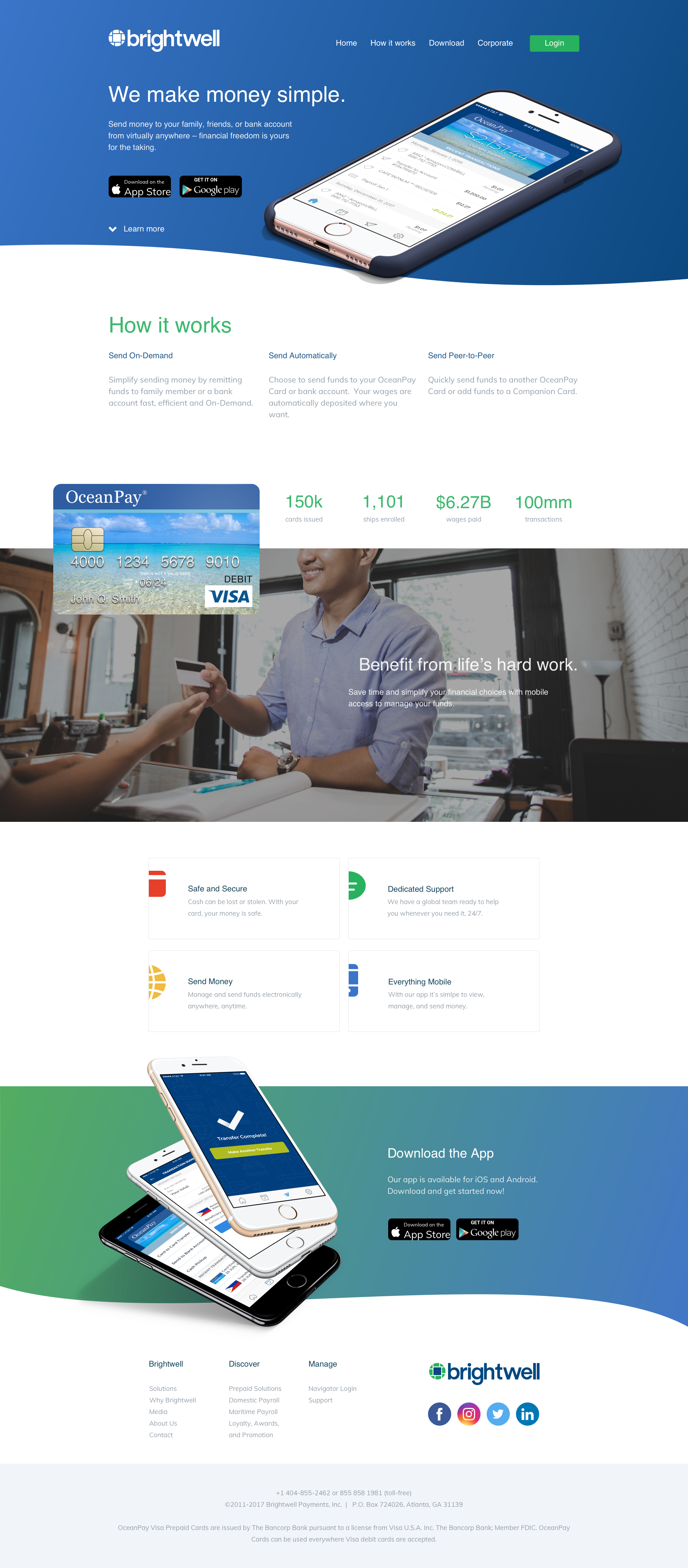
A sample of the homepage, before I joined Brightwell:
The image above is a screen shot of the homepage, branding, and overall “feel” of the company, products, and services.
A sample of the UI/UX before I joined Brightwell:


“I worked hard to build empathy with the users, understand their unique and nuanced situations, and prescribed development solutions to meeting user goals, education, as well as business goals and initiatives.”
In addition to establishing a design system (which gave developers as well as marketers freedom to build solutions), I also lead and executed a complete rebrand of the company and its services from the ground up.
I started with the logo. The Executive team wanted to see explorations on a brand new logo, so I spent an afternoon sketching. I was initially looking for clever ways to use glyphs and geometry to make a multi-meaning logo (mark).
I spent the next couple of days putting down any and all ideas that came to mind. I would frequently check in with stakeholders and decision makers to talk through various elements & styles.
Through rounds of feedback and iteration, I took the strongest visuals and began to explore a color palette, typography, and layout.


After a presentation to the executive team and leadership, I presented these refinements at a company “all-hands” meeting. I walked the company through the brand archetypes that had been identified by marketing leadership, with visuals and justification for each.
My recommendations for various types of marks which spoke to different branding archetypes. These were part of an “all-hands” town hall meeting and I chose to show black and white versions as a color palette had yet to be curated and decided upon.
As a team, we decided that the “Everyman” brand archetype was the best fit for representing our users as well as how we wanted to communicate with them. The final logo is displayed in a few flavors below.
The final mark ended up being a version of the original logo. It is essentially a zoomed in version of the asymmetrical “stone well”. I assigned this visual to the “Everyman” brand archetype as it played on a few levels:
Transference of brand equity - a similar visual with a circular mask to help balance the original visual.
Many pieces coming together, fitting together, to make the whole.
I found favor in selling the logo to resemble a “chip” in debit and credit cards. The key component of the service was the debit card issued to all users of the platform. If the app was the wallet and vehicle for remittance/payments, then the chip was the functional component that made physical transactions possible.
The official logo to supersede and replace all logos across all properties, digital and print alike.
Finally, I pulled all of the identity work together and produced a v1 document for the company to use as a guide (as opposed to hard rules). The goal was the first attempt in getting all departments (product, marketing, support, operations, sales, etc) using the same assets, colors, fonts and visuals. I personally believe in small efforts and iterations leading into big things. All of this work gave the company common ground, a foundation, to begin the unification process.


Once we had the brand archetype established and knew how to approach our customers, as well as the visuals worked out to support the business in these efforts, we redid everything. Here’s a sample of the new brand identity in action via the new homepage:
My process starts as total chaos of ideas and goes through heavy and fast iteration. In this digital age where hard drives and Dropbox storage space are only getting larger, nothing is deleted and everything is documented. You never know when you’re gonna need fresh ideas in a pinch.

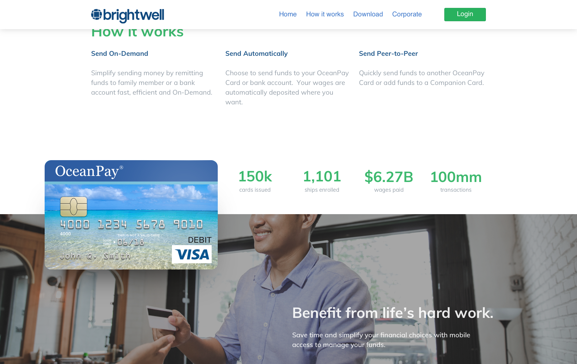
I drew the ocean pay card in Sketch so we could print and deploy SVGs on the web and in the product.


Using our brand style guide as well as rules and regulations, I redesigned our cards. OceanPay had to legally be used on cards per established contracts.
I also took a shot at designing a total exploratory card face: The Brightwell Black Card (because why not!)


I worked hard to consider each and every touch point the user/customer might have with the brand, and did what I could to ensure a unified experience through identity and emotion.
Brand Communication Across Mediums
An example of how a brand’s identity should be communicated and considered at a larger scale, is to consider the visual elements in motion. Video work was an aspiration of the marketing team and I worked to outline some motion design principles early in the process:

A branded document I created to communicate a simple motion sequence for a third party agency helping us with production.


Process
Understanding the User and/or Problem
Many of Brightwell's users were used to remittance technologies like Money Gram or Western Union and had a widely shared perception that financial technologies were 1. challenging to use 2. untrustworthy while at sea and 3. were out to take their money. In short, every single person I talked to while conducting onsite research hated all forms of financial technologies. It was new, confusing, and seemed to be working against personal goals and aspirations of individual wealth building.
In contrast to perceptions, Brightwell made money on the daily currency conversion rate and sought to increase the volume of digital transactions.
A critical behavior that undermined Brightwell's business goals was when users would empty their accounts every payday at the first available ATM - as cash in hand felt safer than “numbers on a screen”. This cash in hand ultimately would work against users' aspirations as it was easier to spend, gamble, and was open to physical theft as no one but officers had private quarters. Perceptions from crew members drove behaviors that were detrimental to both individual goals as well as Brightwell's revenue goals.
What I did & Why
I worked closely with Ashanti, Brightwell's data scientist, to uncover as much behavioral data as we could gather. I also went on board an international cruise ship for 10 days and conducted studies via interviews, first hand observation, and usability engineering. I produced a 5-page report covering crew member sentiment, actual behavior analysis, as well as a written UX report detailing choke points and ejection metrics to discover why people didn't trust financial technologies.
I determined that the number one issue people had was per-transaction fees and that the business should consider the value of dropping the charge policy (and forego this point of revenue) to capitalize on currency remittance fees as well as conversion revenue.
Crew members were transacting with each other daily and were hit with a $1 fee whether the remittance was international back home, or peer to peer while in port. When users wanted to transact every day, they found fees at every turn. To circumvent per-transaction fees, they would take the one-time fee at the ATM and perceive this as a money-saving behavior. If users pulled their entire balance, Brightwell was not able to generate revenue off of the daily banking currency rates. The strategy I proposed was to negate per-transaction fees to keep money in the accounts, as the potential revenue off of daily currency fluctuation in the markets was a more considerable sum than per-transaction fees.
UX Begins With People
Say what you want about “User Personas”, but if you don’t have a common idea across company departments, things get sloppy real fast! I worked with many people and spent time with 20+ hours of audio interviews (done by a UX consultant before I joined) to understand sentiments, understandings, and everything I could glean. I used the established brand identity guidelines to produce a picture of three key users we identified: The “Financial Beginner”, The person who is “Ready For More”, and finally the “Goal Achiever”. When we paired these personas with tasks or “Jobs To Be Done”, it gave us a clearer picture of what the software needed to do, and how these different people felt.


Next came product work! Countless brainstorming sessions with leadership, Product Managers, and Developers ensued. Below is a sample of what whiteboard-to-prototype would look like:

White-board sessions typically were massive brain dumps of many things: assumptions, hypothesis, first hand data, opinions, competitor’s solutions, etc.

Once I understood what we needed to do, what was technically capable, and how different people would need to get these tasks completed, a simple schematic would be worked out for one last review with engineering.

I frequently lead UX discovery sessions and model building meetings using InVision’s Freehand tool. It’s like a whiteboard in the browser and it was brilliant for drawing loose wires in team settings, with local as well as remote team members.

Brightwell was a mobile first shop but I did my best to include desktop considerations as well.

Following Apple’s HIGs and Googles Material Guidelines, I built flows for both iOS as well as Android native design languages.

Prototypes would typically grow rather large so I began to separate tasks out into their own Sketch App files, and I would use Dropbox’s version history to version control the designs.
After prototypes and task flows were established, it was time to get to work on the visual experience aka the User Interface. My design process was mobile first, desktop second. A business goal was to encourage users and customers to download and use native apps, so iOS and Android got the majority of love. Here are some screen sets I designed:
Mobile Phone Views
User Sign Up, Login, & Password Recovery


Various Application “Wallet” and “Payment” Views:


Remittance & Payment Views:


Transactions & Spending Reports


Rendered Marketing Assets


Desktop/Laptop Views
Onboarding:


Dashboard Empty States:


Dashboard View:


product documentation
Dealing with finances and the technology that drives financial empowerment, means you get to deal with a lot of sensitive and proprietary information. Much of the documentation, principles, and structure of the artifacts can’t be shared.
However, here is a sample of the countless product styles guides, patterns, and component libraries I produced. I built, documented, and maintained these patterns and components throughout the entire implementation process. You can get a lot figured out and built up front, but you can never account for everything - iteration, flexibility, and teamwork are the names of the game!
After we turned everything into components following the Atomic UI Model, wide and sweeping changes were possible with the web product as the power of CSS preprocessors. This let us segment users, conduct A/B testing, and let us discover the best way to keep users from getting stuck.


A product style guide I built off of the marketing style guide. Some elements like color and type are identical however expanded from it’s v1.


Result
Outcomes & Learnings
I worked with front end developers and product managers to establish a style guide and design system which unified mobile and web properties and received massive praise from companies like Carnival, Princess, Costa as well as other sub fleets of cruise lines.
I helped establish a format for education inside of the app and leveraged relationships built while on the ship to gain further insight into behaviors and perceptions.
What Happened Next
Brightwell did not change their business model, but the UI, UX, and branding work I completed persists to this day in their marketing materials as well as their product lines.


